Happy Halloween, everyone! But considering the world we’re living in is an apocalyptic hellscape, it’s like every day brings us fresh, Halloween-like horrors!
…Okay, that’s a little too negative for this site about gaming love. After all, no matter what happens, we’ll always have positive gaming experiences and the friendships and bonds they help create to get us through things. I got a firsthand glimpse of this at the recent Portland Retrogaming Expo, a yearly convention that celebrates the rich history of gaming. It was a fantastic show, filled with arcade games, classic consoles and games, an interesting variety of vendors, some great panels, and museum exhibits that included unreleased NES games and the Sony Playstation Super NES CD. The show was great, the people were great, everyone was happy, and good times were had all around.
Of course, a lot of the vendors were selling old games and consoles, and I’ve come to realize I’m almost completely over my game-collecting phase: with so much making the transition to digital, I’m more inclined to collect things where physicality is more important. Most of what I bought at the show was game-related merchandise, books, and crafts from local artists — I didn’t acquire any actual games. Not to hate on people who do collect games: I just find collecting things related to games more interesting in general than owning a whole roomful of titles for every console under the sun. (I’m more about acquiring and holding onto the games that really mean a lot to me.)
There was no shortage of merchandise at PRGE. Lots of cool stuff could be had from a variety of sellers, but I also saw a lot of random crap that left me scratching my head, pondering why it even existed. Do companies really believe we, as fans, are so lacking in taste that we’ll buy anything with a familiar game character on it, no matter how ugly or devoid of value? Well, um… yes. And the fact that this crap keeps getting made is proof that someone — many someones, in fact — are falling for it.
So today, on this most frightening of days, we’re going to be looking at some of the worst pieces of gaming-related merchandise out there. Truly spooooooky!
I didn’t want to make this too easy for myself, though, so I put some rules down for this feature.
- No T-shirts. As painfully terrible as many gaming T-shirts are, I already ranted about them at length.
- It has to be at least somewhat retro-flavored. There’s some really bad Fallout merch, I know, but I’d like to keep this more focused on the commercial exploitation of nostalgia.
- No Funko POPs. Fish, barrel, you know how it goes.
With that in mind, let’s take a look at some merchandise that’s so bad, it’s scaaaaaaaary! (…okay, I’ll stop)
I was surprised to discover that there aren’t really a lot of truly bad Nintendo licensed products. Their licensing department is pretty strict, meaning most of the Nintendo stuff you buy has to meet a decent quality bar before it hits the market. The biggest complaint I have towards a lot of Nintendo licensed stuff is that it tends to re-use a lot of the same stock art of Mario and Link over and over, but at least you can walk into Toys R Us and buy a Luigi backpack with an on-model character image and nice construction.
Let’s start with “visually offensive.” Here’s a baseball cap that should cause revulsion the moment you see it:
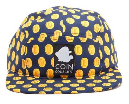 Good GOD, what a mess. This looks like the kind of hat you’d see Matthew Lesko wearing in an infomercial. On top of that, the connection to Mario is limited: you’d have to get close to the wearer to see the Mario emblem in the center, otherwise it just looks like an ugly-as-sin polka-dot baseball cap.
While that one is ugly, this is just really sad in a weird, hilarious way:
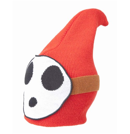
This is one of those cases where it’s like, okay, I understand what you were going for here, but the idealism of the concept clearly did not match the quality of the execution. And honestly, I’m not really sure if you could execute this well and still make it comfortable. Solid idea that just doesn’t work in practice.
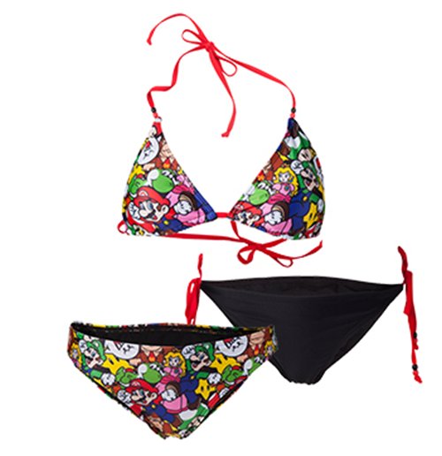 Hey ladies! Would you like to wear an unintelligible jumbled-up collage of Mario characters during your sexy beach funtimes? Nothing screams “Wet hot summer” like a bikini that’s an awful mess of clashing colors and beloved characters!
I’ve actually seen a few Nintendo-themed swimsuits, and this is easily the worst. The others are actually pretty okay — I’d even say the Hylian Crest swimsuit is pretty darn good, in that it actually makes for a decent-looking fabric pattern.
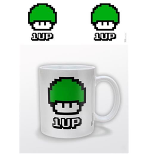 Okay, I’m not entirely sure this is licensed, because I think Nintendo would have demanded this sort of error get fixed. But seriously, how do you manage to screw up the design of a 1-up mushroom this badly?
![]()
Unlike Nintendo’s fairly strong licensing standards, however, you can basically slap the Atari name on anything you want to poop out, because lord knows they’re doing nothing but making bank off the nostalgia associated with the brand. Above is an example of something that irritates the hell out of me: fetishism for Japanese text when it’s absolutely not necessary. While “Atari” is a Japanese term, the staff decided on that name because a couple of them played Go. Atari’s as American a company as they come 1. You don’t need the katakana on there except to look vaguely exotic. Hell, I bet most of the people buying this can’t even read the kana, putting this in the same category as tattoos in Japanese you ran through Google Translate and got anyway because you thought they looked cool.
If we’re going this far back in the nostalgia mines, though, we have to talk about Pac-Man. There’s a fair amount of bad Pac-Man merchandise, though few it it reaches the horrors of what came out during the height of Pac-Man fever in the early 80s. (That bank is the funniest and saddest thing, holy crap.) But there’s plenty of modern awfulness, too, such as:
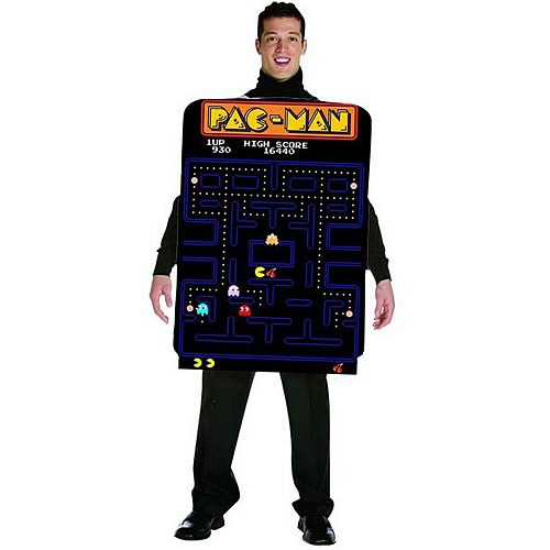 I’m honestly kind of impressed that somebody came up with something worse than whatever you can imagine a “sexy Ms. Pac-Man” Halloween costume would be. Doesn’t mean I’d be caught dead wearing it, though.
 Everything I wrote about terrible T-shirt designs also applies to mugs, which have a tendency to use many of the same ideas. Here we’ve got a fine example of a rancid old meme applied to a situation that I’m pretty sure can’t actually happen in-game. Talk about an epic fail, am I right?
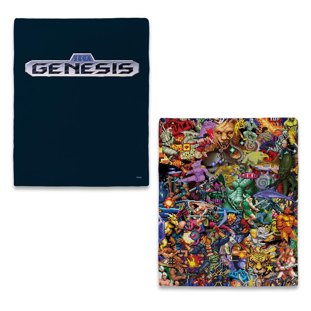 Sega opened an online store recently, and while it’s still small, there’s room for them to grow a bit. (I’m hoping they’ll eventually sell some of the Japanese merchandise from shows like TGS). A lot of the non-Sonic stuff on there leaves something to be desired, however, especially the nostalgia offerings. Take this Genesis-themed blanket, for instance: console logo on one side, horrible jumbled Where’s Waldo-like sprite collage on the back that makes the Mario swimsuit look restrained in comparison. This is painful enough to look at in a JPG image, I don’t even want to think about how bad it’ll look on a $55 (!) throw blanket.
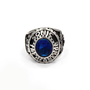
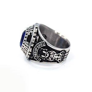
Okay, so, there’s a fair amount of weird Sonic stuff out there, but this might be the biggest head-scratcher. It’s a faux class ring.
I don’t think class rings are a thing outside of North America, so for the benefit of our international readers: class rings are a giant racket almost entirely controlled by a single company (Jostens) designed to get students to blow hundreds of dollars at once on a ginormous, ugly ring that “represents of their high school/college experience and shows off school pride.” Nevermind the fact that you’ll be embarrassed in a few years to be wearing one in any sort of professional environment, you need to remember your precious school years! … at least until you decide to pawn it off to a precious metal buyer for pennies on the dollar.
Anyway, these aren’t “real” Jostens-made class rings, but Sonic-themed replicas that show you’re part of the “class of 1991.” They’re also just as ugly as the real thing, so at least they got that part right. Also, look closely and you’ll notice the “G”s are upside-down. That’s some dedication to quality right there!
Out of all the retro-flavored game properties I can think of, Street Fighter definitely takes the cake when it comes to questionable merchandise. I’m not sure what’s up with Capcom’s licensing department, but I feel like sometimes they just don’t care. (There’s a lot of head-scratching bits of Megaman merchandise out there, too — but honestly, I can see the use of a replica helmet or Mega Buster in cosplay at the very least. And, at this point, merchandising is the only love that character gets.)
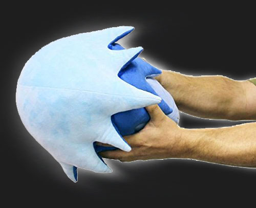
Anyway, that weird, plush blob above is a Hadoken. Not even a character, but a soft physical representation of a wave of energy that loses almost all meaning since a. it’s a bunch of blue plush cobbled together and b. there’s no way it can actually float. I imagine it’s fun at parties for like five minutes while you drunkenly yell at your pal Mike to “catch my Hadoken bro!” but once that’s over, you’re stuck with a sad little blue plush lump that’s maybe useful as a dog pillow.
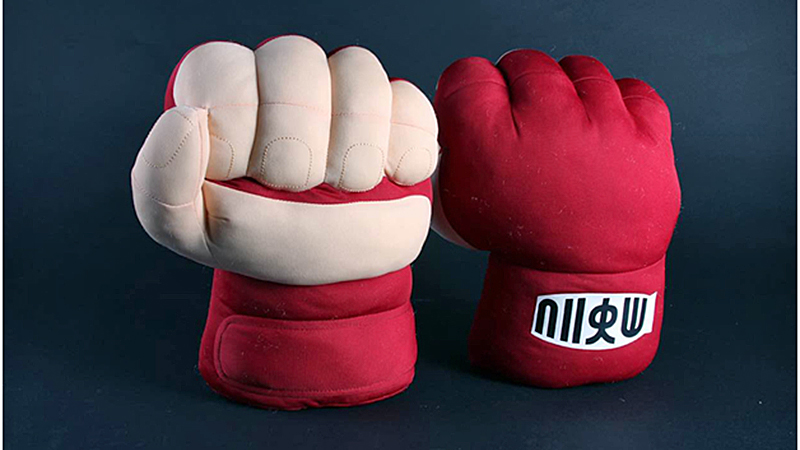
Is there any piece of merchandise stupider than oversized novelty fists? Hulk hands are fun… when you’re eight years old. These just tell the world you spend way too much money on something that makes your appendages ugly and unusable.

More ugly-ass hats, now with added uncanny valley face model! This Blanka hat is another one of those “decent idea that turns out poorly when made into an actual thing” situations. Using an extreme close-up of ugly Street Fighter IV art is bad enough, but the “hair” on the back is less “while and crazy electric monster hair” and more “we had this left over after our last fursuit commission.” A bad look all around, but not quite as bad for poor Blanka as…
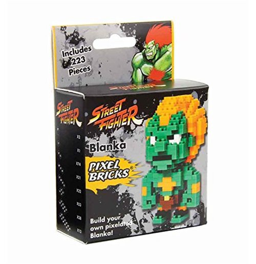 Ughhhhhh. Okay, these little lego-knockoff kits are kind of trendy lately, and there are some pretty cool kits out there, but this is definitely not one of them. In trying to cram too much detail in a small space with these tiny blocks, this kit allows you to create something only identifiable as Blanka through the fact that it has a Blanka-like color scheme. It’s not even one of those tired “SF character as a Megaman sprite” renditions, it’s something that’s both original and ugly as sin. There are a few other SF characters, too, and they’re also pretty bad, but I’m just disappointed at how Blanka never seems to catch a break inside or outside of the games.
(By the by, if you want to see really cool abstract block renditions of fighting game characters, follow seibu_lina0505 on Twitter. It’s good stuff.)
Well, I think that just about does it for now. Maybe I’ll go back to this well sometime in the future, I don’t know — lord knows there’s plenty more bad gaming merchandise coming down the pipe every year. And hey, I made it through without getting mad at any bad T-shirts, I think that’s —
Nevermind. I’m going to go seethe in hate now.
- Well, it’s French now, but that’s not the point ↩