
Hey guys, did you hear the news? Ever since Sonic Mania, Sonic is good again! I mean, nevermind that Sonic Colors came out and is easily one of the best platform games of that generation, Sonic officially doesn’t suck now! Rejoice!
And what better way to celebrate the triumphant revival of one of gaming’s most beloved and enduring characters than with a lavish artbook by Amsterdam-based modern/digital art publisher Cook and Becker? Why, that sounds like exactly the sort of thing I’d love to put on my shelf!
So here it is, Sonic the Hedgehog 1991__2016, a book celebrating Sonic’s 25 anniversary and packed with art, development anecdotes, and rarely-seen concepts, all printed on that sort of expensive, glossy paper that makes you feel like you’re ruining the book with your filthy fingerprint oils if you even think about touching it with your bare hands. This is the standard edition, which runs $47 USD plus shipping (which, while I don’t recall the exact amount, wasn’t as exorbitant as I expected.) There’s also a limited edition that comes with a lithograph for $125, but I decided to get just the basic book: I have more than enough prints and posters right now.
So let’s get a move on and dive right in to this hefty book!
The book begins with a few double-page spreads showcasing Modern, Classic, and Sonic Boom-styled Sonics. It’s a nice way to start things off, though some of the impact is lost thanks to Sonic’s face being almost dead center with the bookfold, as seen here:

I mean, yeah, it’s a great image with a lot of impact, but it’s kind of hard to ignore that huge fold bisecting Sonic when you look at it. Not the best layout choice, there.


Much of the early part of this book goes into detail about Sonic’s character development, from the initial concepts for a recognizable mascot character for Sega (they even showcase a bit of Alex Kidd) to detailing the refinements the character design and backstory would go through. There are a lot of interesting anecdotes here, and yes, they do bring up that weird initial concept where Sonic had a human girlfriend. Thank god they never revisited that idea again! oh wait
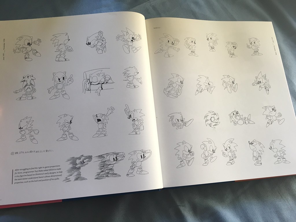
These early Sonic concepts are some of the highlights of the book. There’s a whole mess of material here I’ve never seen before, and it shows how much Sonic’s initial design was inspired by old American animation (with maybe a dash of Tezuka thrown in for good measure). It’s a far cry from how he’d wind up looking in the final game.
(Can you imagine this Sonic style in Cuphead, though? Now that’s a crossover I’d love to see.)
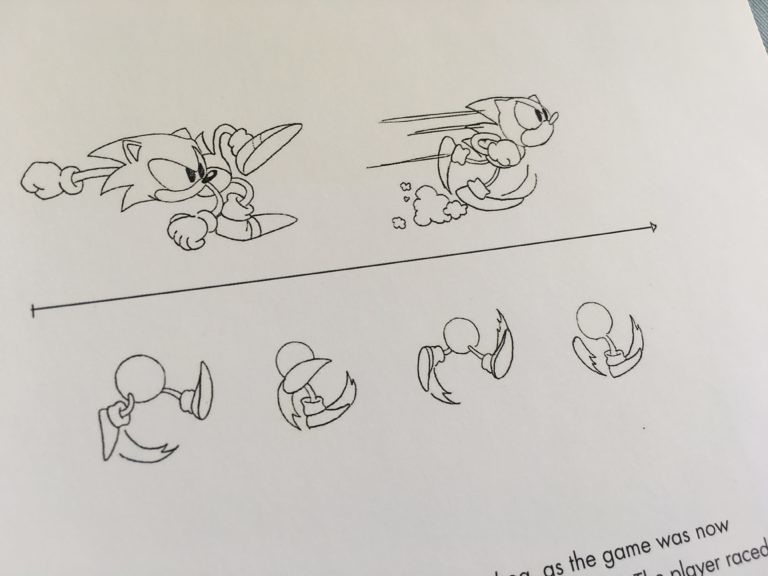
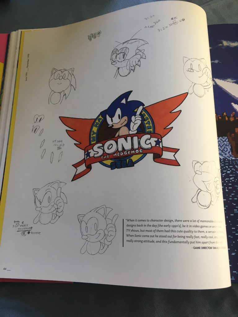
Concept sketches of Sonic running. Again, you can see that cartoony rev-up-and-run style with exaggerated spinny feet, though the former part wouldn’t make it into the game.
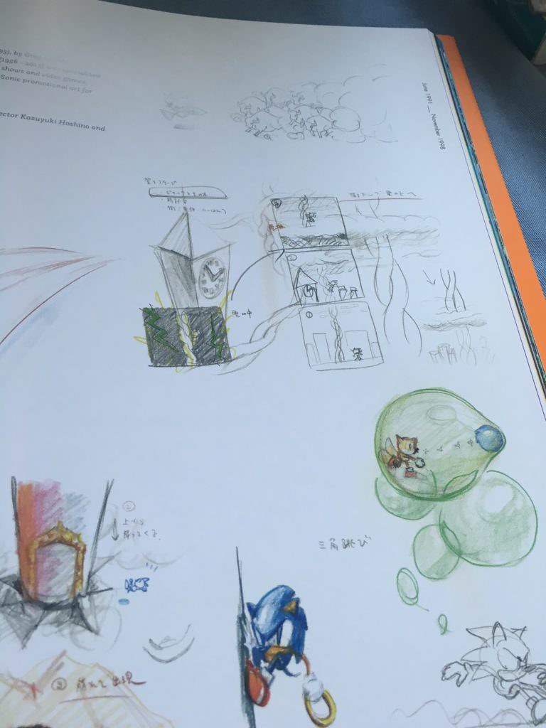
Every so often you’ll run into these semi-transparent rice paper inserts. This one contrasts the concept art of the famous Green Hill Zone loop-de-loops with the final product.
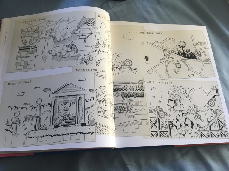
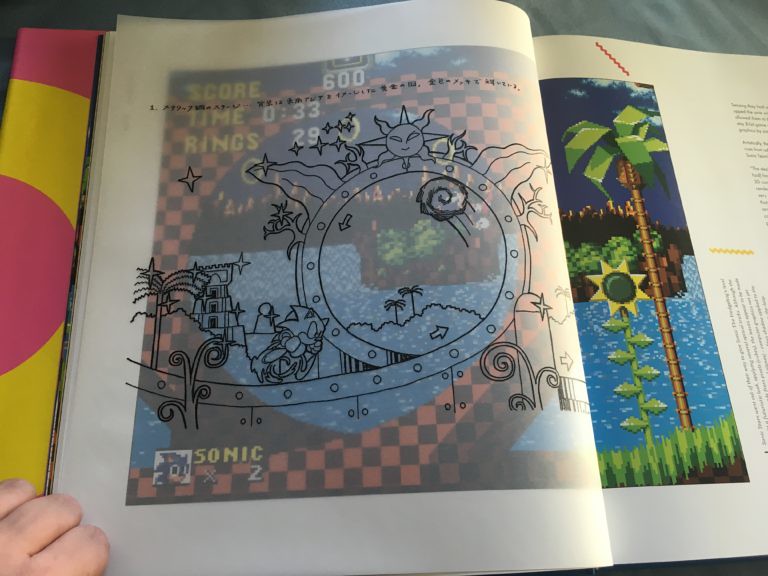
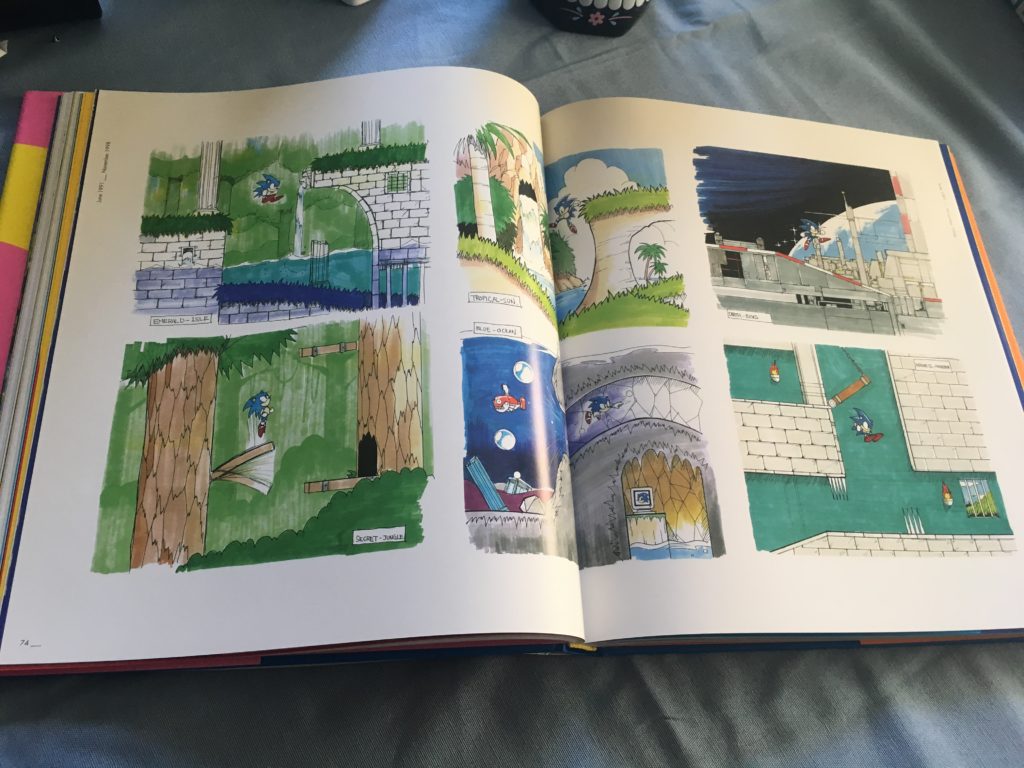
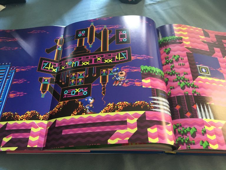
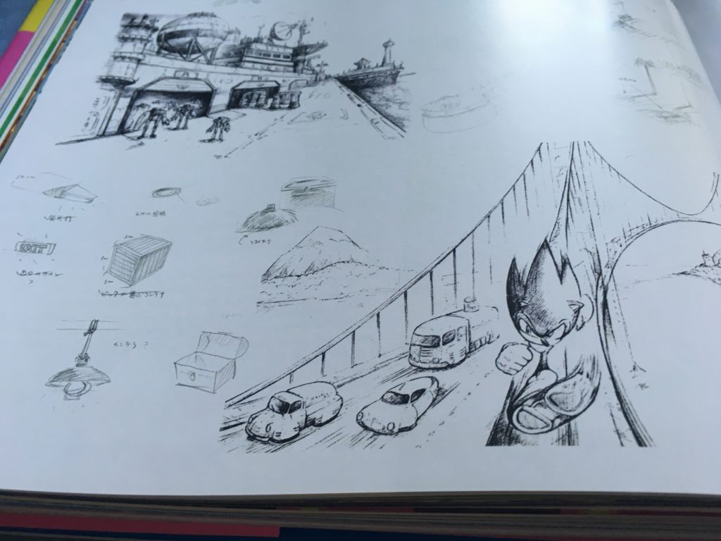
Initial concept art of the game’s various levels. Some look pretty close to the finished product, while others (like Star Light Zone) are almost nothing like final game. It’s also another case of the layout being disrupted by the fold in the center, though it’s not quite as bad here.
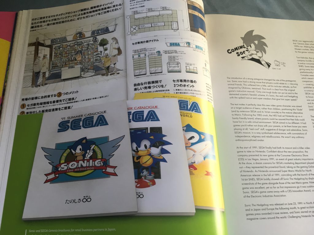
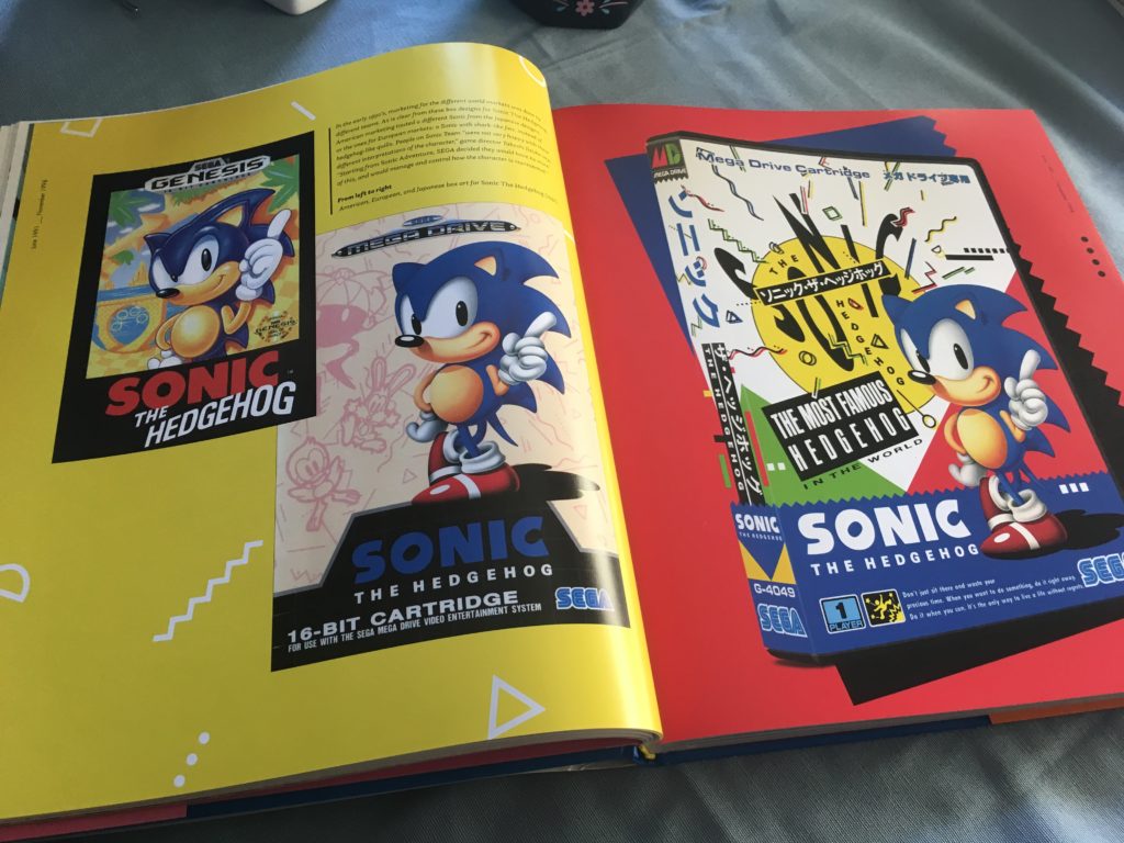
This stuff is pretty cool. We’ve got some internal concept art of how Sega planned to position Sonic on retail kiosks and themed shelves, as well as Sonic appearing on retailer-oriented product catalogs. (Remember product catalogs?) There’s also a nice comparison of the Sonic game covers from the US, Europe, and Japan, along with some commentary on the design variations.
Animation tests for Sonic’s finger-wagging in the game intro. It’s neat to see how well this carried over into the game itself.
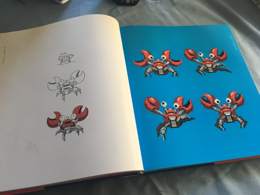
I guess it’s time for me to go into one of my biggest complaints about this book: how it chooses to use its space and pages. We see a nice set of images that shows the evolution of an enemy design from concept to final sprite. That’s pretty cool… but look at all that unused white space. Did we really need that to take up a whole page? Could we not have fit some more concept-to-final progressions on there somehow?
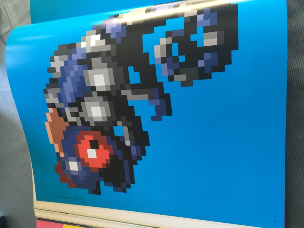
The second example above shows an enemy sprite blown up to fit an entire page. I can only look at this and think “why was that necessary?” It’s especially annoying when you get later into the book.
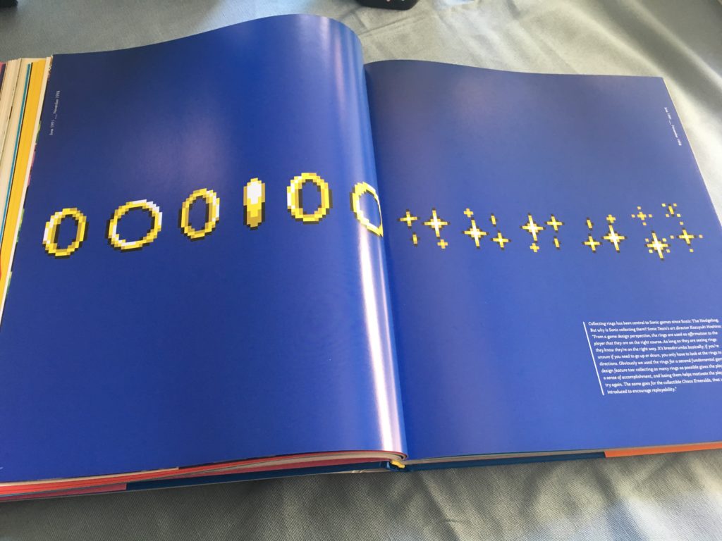
Ah, yes, we definitely needed a two-page spread highlighting the most common item in Sonic games. I just can’t get enough of looking at rings! What? More concept art, you say? pshhhhhhhh
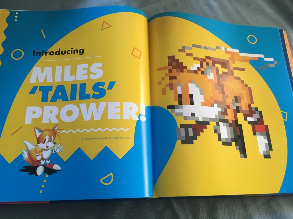
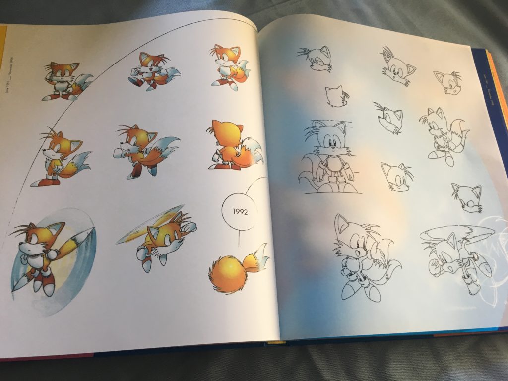
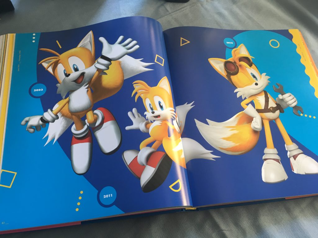
Now we’re getting into Sonic 2-related stuff, and there’s quite a bit here, especially with regards to Tails’s design. Whenever a new major character comes into the series, the book essentially “pauses” for several pages to do big, multi-page spreads highlighting that character, as seen here. It also feels free to jump around in time a bit: those CG images of modern Tails you see there are immediately after his design sketches from Sonic 2… and after this section, the book jumps right back into Sonic 2 related content. It’s a bit jarring!
Sonic 2 zone design sketches. These look amazing…. and are cut down the middle again. Book, you need to stop.
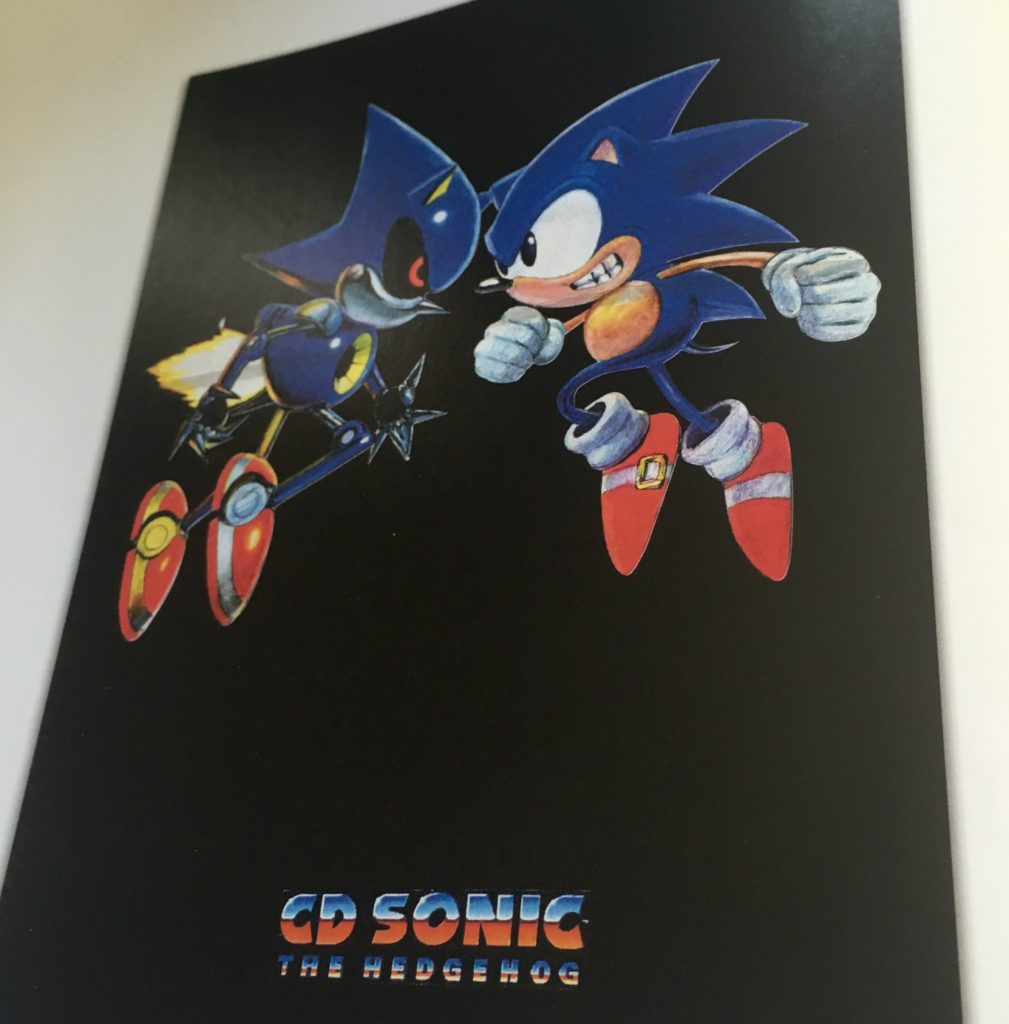
After Sonic 2 comes the Sonic CD stuff. One of the first things we see if this mockup for what would be the Japanese cover of the game, which shows why we should never ever see Sonic with teeth. GOD that’s freaky.

The Sonic CD section is what I was most looking forward to. I consider Sonic CD to have some of the strongest art design of any game in the 16-bit era, and I was eager to see if the book would include any concepts of the scrapped, legendary-among-insufferable-Sonic-nerds-like-me R2. While it does feature concept sketches of some of Sonic CD’s enemy designs, there are only a few things related to R2 — much of the stuff seen in this making-of retrospective isn’t even there. No level concept sketches at all, either! At least what is there is pretty darn cool, but dangit, I really wanted more Sonic CD stuff.
Actually, I’d be glad to buy an artbook with just Sonic CD design images in it. Somebody please put that together.

Since Amy Rose was introduced in Sonic CD, they put here character section here. So, uh, why are there GBA character sprites and modern character art in the middle of the Sonic CD section? Again, this sort of disorganization is irritating.
This fold-out photo spread is pretty great, though. Love how Sonic just looks like “welp later Amy”

I do really like all the weird Eggman sketches in the Sonic CD section, though. Look at these little munchkins!

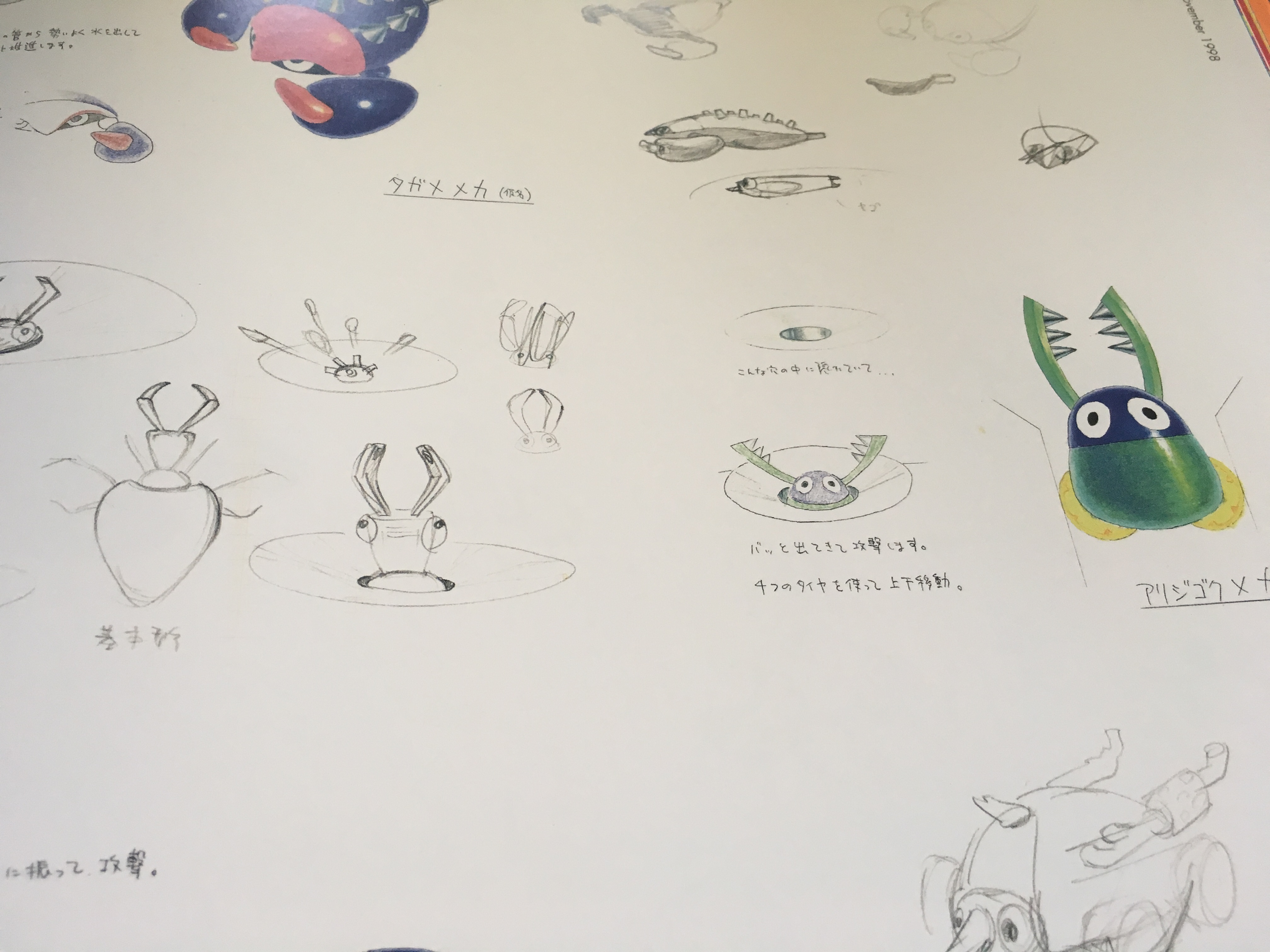
More cool Eggman designs, including concepts for the scrapped R2 boss and an early version of Palmtree Panic’s boss.
These concepts aren’t identified in the book itself, but it’s pretty obvious to us hardcore classic Sonic nerds that they come from Sonic Crackers/Sonic Stadium, the prototype that would eventually be made into Knuckles’ Chaotix. I definitely would have liked to see more of these, as the details of how that game evolved from an early prototype into the finished product seem utterly fascinating. (Look at that bubble concept! That would have been so neat in-game.)
Speaking of Knuckles… what’s up with the Sonic 3 section, you might be asking. Well, I’m also very curious, because there’s almost nothing related to Sonic 3 or Sonic 3 and Knuckles in this book beyond some concept art for Knuckles. No level concepts, no enemy designs, nothing. It’s a really obvious omission, and it’s a real shame, because there is plenty of great design work that went into Sonic 3. Seriously, you guys blew a bunch of pages early on giving us detailed speads of ring sprites, but couldn’t give the Sonic 3 games more than a cover art comparison and some Knuckles images? That’s phenomenally disappointing.
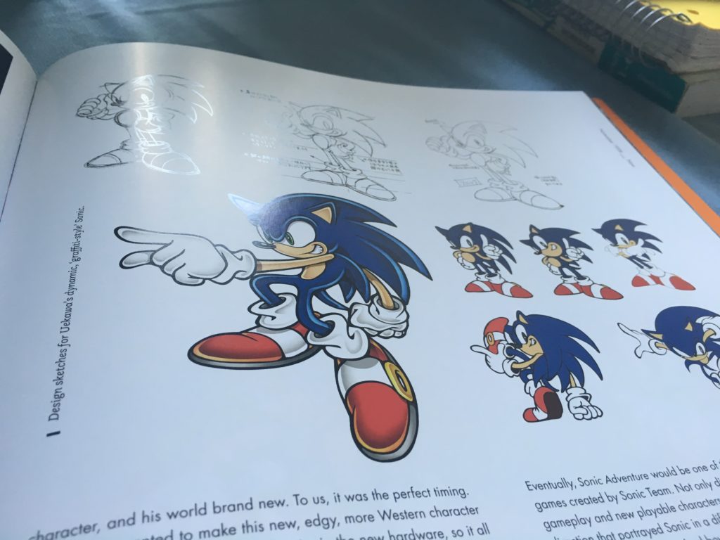
The book then shifts into the era of Dreamcast Sonic, going into detail about Sonic’s updated design and showing a lot of concept art from the original Sonic Adventure. There’s a lot of good stuff here, and it’s interesting to compare to the final game.
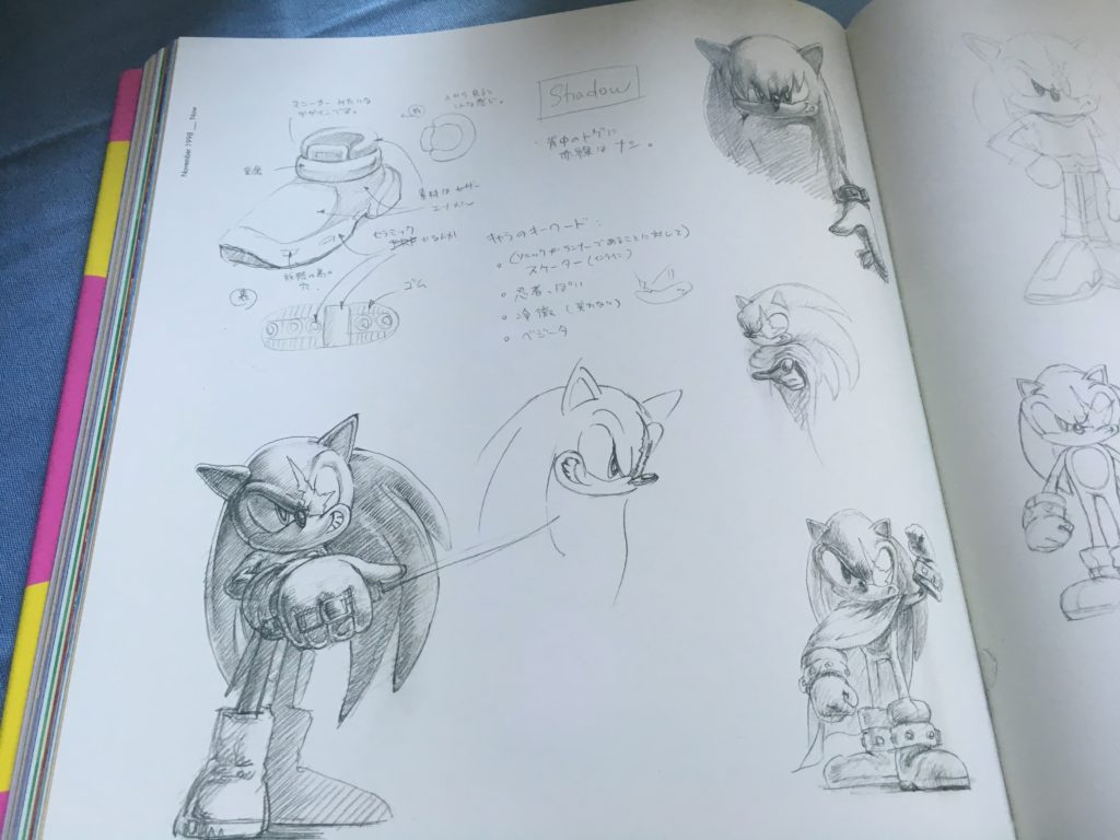
Oh, now this is precious. There’s a lot of concept art for Sonic Adventure 2, and a good chunk of it is Shadow the Hedgehog. These designs are an absolute delight to see: a lot of people give Shadow shit for being a faux-edgy design, but as you can see here, it could have been so much worse. (I’m a little sad the Japanese design notes aren’t translated, either, since once of them explicitly refers to Dragonball Z’s Vegeta as a guiding design concept for Shadow.)
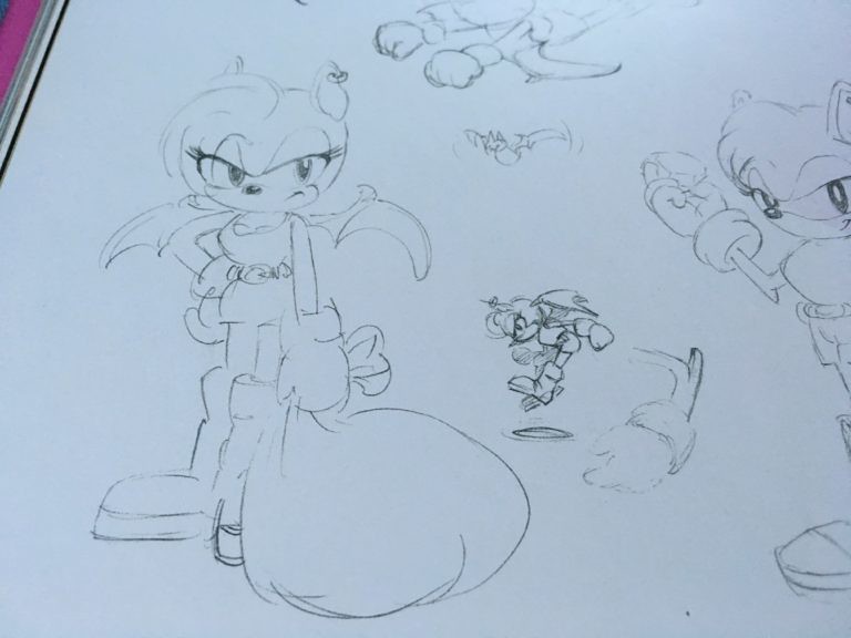
Some concept art for Rouge the Bat. Here, she looks like scrapped Sonic X-treme heroine Tiara Boobowski, and I will never stop rolling my eyes at how someone at Sega of America thought that was ever a good idea for a character name.
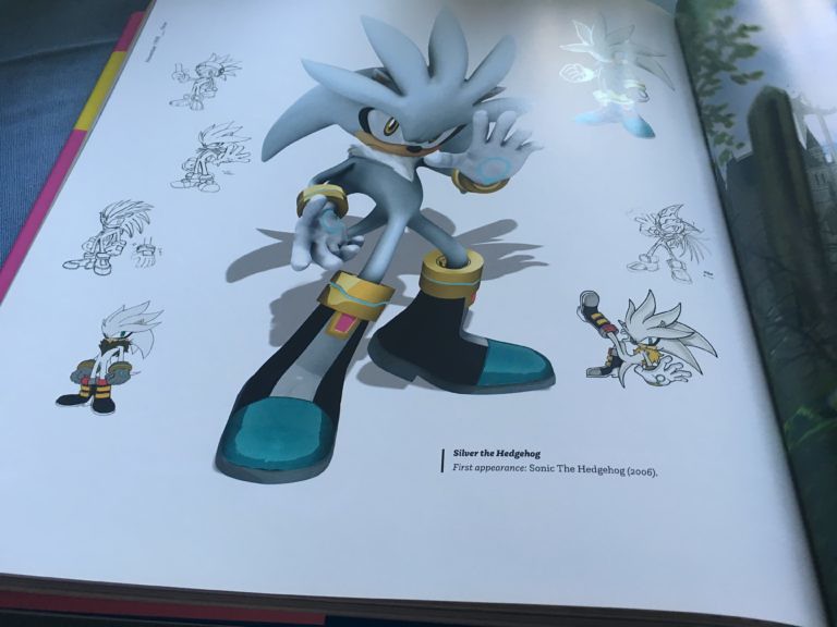
There’s not a lot of Sonic ’06 stuff in here (and some would say thank god for that), but the Silver design concepts are pretty neat.

Unfortunately, most of the Sonic games of the past decade or so are only showcased in these CG render spreads. Here’s one from Sonic Colors. I really wish we could see some more design concepts from Sonic Colors, because that game is so darn pretty.
Overall, my feelings on this book are somewhat mixed. I’m glad I bought it, because the material it does have is fantastic. However, it really feels like it’s missing far too much to be considered a truly comprehensive history of Sonic artbook. It’s not just me being nitpicky about Sonic CD, either: There’s almost no Sonic 3/S 3&K material, no mention of scrapped projects like Sonic X-treme, and almost nothing shown design-wise after the Sonic Adventure series. (And you can forget all about spinoffs like Sonic Drift and Tails Adventure, too.) The amount of page real estate devoted to minor stuff is baffling, as are the layouts that are frequently marred by the bookfold. It’s worth buying if you’re a big fan of classic Sonic like me, but even if you are, you’re probably going to feel somewhat disappointed by its omissions.
Nevertheless, I’m sure that someday we’ll get the perfect history of Sonic. Someday, all the secrets of R2 will be revealed. Someday…
As the world’s only Silver fan, I’m glad he got some love in here too.
Thanks for the review, I saw the book at a game show and wondered what was inside. It’s a shame like you said so much was omitted.
That one sketch- that you said looks like Tiara Boobowski. I think it’s actually Rouge concepts, perhaps when she was referred to as Nails.
I don’t know why the idea of Sonic having a human girlfriend seems so weird to you guys. Roger Rabbit came out a few years earlier than Sonic and that had Jessica Rabbit in it. Princess Elise was just a lame character from a lame game that didn’t fit in with the Sonic universe.